Our Decision-Making Framework for Building an Angular UI Library
Our Why, How and the Lessons Learned

TLDR: When I joined the Mango team, the designs by Tobi Olowu were already complete. After evaluating the available UI libraries against our three key criteria (design customisation, Tailwind CSS support and long-term maintenance), I concluded that building our solution, the Mango UI Library, using the Angular CDK with Tailwind CSS would best serve our needs. This article outlines why I made that choice and everything I learned along the way.
In The Beginning
In November of 2023, I joined the Mango project to bring the Mamvest products to life. The completed designs by product designer Tobi Olowu would be built using the Angular framework, and this was the only fixed requirement from the engineering manager; everything else was up to me.
As I reviewed the Figma designs, an interesting pattern emerged: there were only a handful of components, but most of them had designs that didn’t match any of the existing Angular component UI libraries.
There were the expected elements like the button, input with validation, cards and badges, but also highly specific components like custom accordions, dialogs, custom file input, password rules, and even a sliding modal with specific animation requirements.
Next, I started the search for a component library that would work with our designs with minimal friction. I planned to use TailwindCSS as it would allow us to write CSS faster and would ensure that CSS was consistent across the team.
The most important question became: which UI library would meet our requirements?
Our Ideal Library
By now, I had settled on three non-negotiable criteria:
Easy customisation: This would prevent us from fighting the UI library to bend to our needs with styling overrides at every single point.
Tailwind support: We needed a library that either used Tailwind internally or could be styled without wrestling with opinionated defaults.
Longevity: The library needed to be stable and actively maintained. I looked at GitHub activity (stars, forks, creation date), npm download trends, Stack Overflow discussions, and how quickly maintainers resolved issues. The number of open issues was not as important as how long they stayed open.
Next, I started evaluating Angular UI libraries against our established criteria.

Evaluating UI Libraries Against Our Criteria
After evaluating the libraries, three options stood out: Angular Material, PrimeNG and Spartan. There were, however, issues with those choices:
Angular Material & Tailwind: Our early proof-of-concept tests revealed styling conflicts and the need for constant overrides to match our designs. This meant we would spend more time fighting the defaults than building features.
PrimeNG - v17: It was reliable and production-ready, but at that time had no native Tailwind support. Customising it to match our designs would introduce excessive overhead, and this was unacceptable for mostly custom components.
Spartan: Although tailored for Tailwind and highly customizable, it was still in alpha, and we could not afford breaking changes.
With these constraints established, I decided to instead build the components with the Angular CDK and style them with Tailwind CSS.

Combining the Angular CDK and Tailwind CSS
After making this decision, I purchased a personal Tailwind UI license.
With this, I had a starting point:
A Tailwind UI license to speed up component scaffolding
The Angular CDK with built-in accessibility primitives like the
FocusTrap,Overlay,Menusand theA11yModulethat enforce accessibility.
With this combination, I had a solid foundation.
Cross-Framework Research for Accessibility
To better understand accessibility behaviour in real-world components, I studied Radix UI extensively.
The Angular CDK is to Angular, what Radix is to React.
~ Ovuoke Aghwotu
For our Checkbox Menu component, I studied how Angular Material’s checkbox tackled focus and keyboard interactions. I also referenced ShadCN’s dialog for addressing responsiveness challenges in our dialogs.
This cross-framework research allowed me to build components that followed the principle of least surprise. By adhering to established usability patterns, I built components that felt predictable, consistent, and intuitive.
Challenges and the importance of prioritising Developer Experience
Each component brought its unique challenge and lesson. Elements like cards, grids, banners and badges were straightforward, but some others were not. Some of the biggest lessons came from working with native HTML elements like the input, the button, dialogs, menus, etc.
The first component I tackled was the input, and this would teach me one of the most important lessons when building reusable components: unless absolutely necessary, expose the native HTML element directly; avoid wrapping it. This leads to a more predictable behaviour when working with forms and avoids odd bugs.
For creating the reusable form input, I initially used the ControlValueAccessor, but ran into edge cases that made it brittle. Eventually, I switched to using an input directive instead. Error handling was moved from the input component wrapper to a separate component that took in an AbstractControl as its input. This kept the error component in sync with whatever input it was tied to.
Unless absolutely necessary, always expose the native HTML element to the developer

A major indicator that a component needed improvement was Developer Experience (DX) friction, and this was most obvious in the button component.
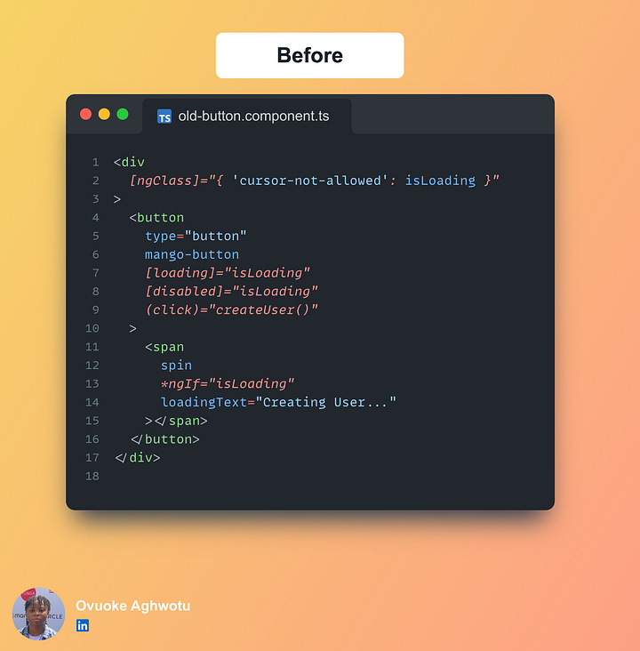
Here, the challenge was how to manage the loading and disabled states. Previously, we wrapped the button element in a container that managed the cursor interactions, and then inside the button, we nested a span element, which handled the loading spinner. Although this worked, it was a hassle, and I continued searching for a better way to build the button.


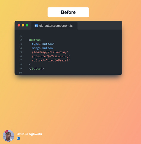
In our current button, everything is much simpler. You can see the button in Storybook here, see an interactive Stackblitz of the button here and view an interactive slide showing how the button classes were combined to manage the variants and states. I will be covering the complete button evolution and TypeScript patterns in the next article of this series. Below is a before-and-after of how the button is now used:
For the components that came in as last-minute requirements, especially when our designer was unavailable, I would build a proof-of-concept, get approval from my manager and then build them. One such component is the document link component.
Tooling and the Developer Experience
Being a bespoke UI library, it was important that it be documented to avoid the bus factor. My previous role at ASI was where I first had the opportunity to see an existing Storybook setup in action, extensively documenting more than 50 components and counting. This was a boon as it allowed me to explore the different building blocks of our products and how they came together following the Atomic Design methodology.
With this knowledge, I wanted the same benefits for our team and scoured the Storybook docs, YouTube videos and Medium articles. I set up Storybook and began documenting the components. I even wrote a bash script for generating a Storybook skeleton from an Angular component.
The Tools That Made a Difference
Communities: The Angular subreddits (r/angular and r/Angular2) provided eight years of archived discussions about UI library choices from small teams to enterprises. Reading about how other teams navigated similar decisions was incredibly helpful, and there were similar discussions in the r/react and r/vue subreddits.


Reddit posts across multiple frontend subreddits revealed recurring developer questions regarding UI libraries. TechStackNation: Seeking to become a better frontend developer and understand Angular better, I joined this developer study group in November 2024. This group would become my go-to place for technical discussions about small and enterprise challenges and a place for community. The group provided access to experienced Angular developers and architects, including direct conversations with Angular core team members and GDEs. This was a game-changer for my growth.
AI assistance: Claude 3.5 Sonnet was my main coding companion, and it was particularly helpful for generating component stories and exploring edge cases I might have missed. With components and libraries that used more advanced TypeScript concepts, ChatGPT was a better aid.
Looking Back and What I Learned
Nearly 20 months later, I can say the approach worked well for what we needed. Here are a few things I’ve learned along the way:
Iteration over perfection: Some components, like the input and button components, did not have perfect DX in their first versions, but they met the UI/UX requirements and delivered business value. As the business requirements changed and we gained more experience and time, we refined them. Ship functional components first, then optimise DX later.
Designer-Developer Partnership: We had an exceptional designer in Tobi. He wasn't just someone who handed off designs and disappeared. For instance, when we built the input component in code and increased the padding because it looked better, he updated the Figma to match. He was always open to brainstorming component behaviour and adjusting designs based on technical realities. Having a designer who views development as a collaborative process, rather than a handoff, made all the difference.
Exceptional leadership: My engineering manager gave me the freedom to make these technical decisions while consistently challenging me to find better solutions. That combination of trust and growth-oriented challenges made this entire learning experience possible.
Great teammates accelerate growth: I was fortunate to work with teammates who shared knowledge freely. Working with people who see knowledge sharing as part of the job makes everyone better.
Curiosity Compounds: Months before the project began, I had watched a Kevin Powell video on height transition in CSS. That tutorial was helpful in our accordion designs. A Codrops article from 2015 that I had read over the years was the perfect reference for designing our custom input file. Learning broadly, even when you don't immediately need it, pays dividends.
Go beyond the designs: When a component's design came as a static mockup, I had room to experiment. For example, for the password rules, I added microinteractions that were not part of the original spec, and these touches helped shape the overall experience of using the component.
The community investment paid off: Investing in TechStackNation and staying active in different Angular communities was not just about this project; it accelerated my understanding of Angular in general and connected me with experienced developers.
Miscellaneous Highlights
My Angular CDK question was featured on one of the official Angular livestreams. That was exciting!
I opened an issue along with the fix for an issue I had observed on the Angular Material CDK docs. It is now part of the documentation.
Conclusion
This project reinforced the importance of early alignment between design and engineering. However, when you are brought in after designs are complete, you have to make constraint-driven decisions that still hold up under scrutiny.
Your next UI decision might be different, but the framework remains the same: analyse what you are building, evaluate it carefully, and commit to continuously improving whatever you ship.
This is the first article in a series. Next, I will break down how the button component evolved and the TypeScript patterns that made it scale. Subscribe to follow the rest.


